
Hello everyone and welcome to this quick tutorial on making your handwriting into a font! As you can already see, this page looks a little bit different than every other page on my site, and it’s because I’m currently using the font based on my handwriting to craft this post! There are a lot of ways to accomplish this: most rely on using adobe illustrator to import and create your handwritten notes and then individually defining letters, but we’re going to do something a liiiiitle bit easier today here at the Paulling Workshop. We’re going to use a prebuilt service called Calligraphr.
The process is pretty simple: Define what characters you want to be in your font, download a blank template of those characters, carefully write those letters in your own handwriting, upload a picture of those papers back to the site, and then build the font into a single font file that you can use to install into programs like Microsoft Excel or WordPress.
So let’s get started:
Step 1: Setup an Account at Calligraphr and Define your Template.
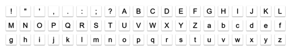
After you log in, you’ll need to create a template of the characters you want to have in your font. I chose “minimal english” “minimal numbers” and a few other commonly used keyboard punctuation marks. If you’re using the free plan, like I am, you’re limited to 75 “glyphs” or characters, and that fills up fast.
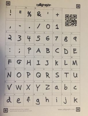
Click “Download Template” and print that PDF form. Name it whatever you want, download as a PDF, and turn on both “draw helplines” and “characters as background”. Those help a lot in keeping your font usable. I suggest making at least 2 copies, because you can upload multiple revisions of the same letters, and that will give your font a more natural looks, as it switches back and forth between different variations of the same latter as you write, so the letters don’t look exactly the same every time.

 Step 2: Fill out your Sheets
You need a thick pen here. They recommend a felt tip pen. I used a normal black sharpie because I wanted thick lettering, but a thin felt tip would look really nice if you have good handwriting.
It’s very important to stay in the lines here. Especially the vertical ones. Make sure that you use the recommended background lines that are lightly printed. I thought at first it would be good to take my time, but honestly its better to write quickly, without overthinking it, so that you write your letters like you always do, without trying to trace the letter faintly printed in the back. I filled out three sets of lettering, and then kept the best two of each letter.
 Step 3 : Upload your Sheets and Evaluate your Handwriting
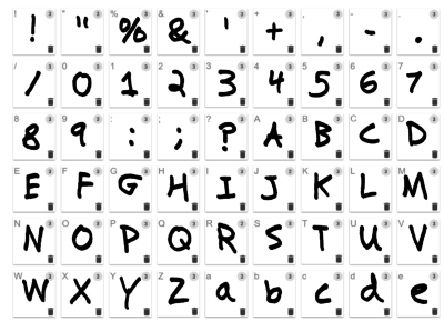
Take pictures of the sheets individually, making sure to include the four corner squares printed on the page, and then upload those picture files to the Calligraphr service. From my Apple Photos app, I shared the pictures with my dropbox, which syncs to my computer, and then I used the upload button on the Calligraphr site to import the files to their service. It will automatically scan and detect your letters, and then you can review each letter and decide whether or not to keep it. If you’ve messed up, or a letter looks weird, don’t keep it! You can always do more.
Upgrading to Pro
If you’re serious about making a full font with lots of characters and variation, the free version of this service won’t cut it. If you upgrade, you can pay for 1 month ($8) and there is no subscription. With that, you get the ability to increase your character count to 480 per font, have up to 15 variants per character per font, and have 12 simultaneous fonts you are working on. You can add ligatures, which are necessary for creating cursive fonts, and can individually adjust letter spacing for each character. I think if I do another font, I’ll try out their pro plan.
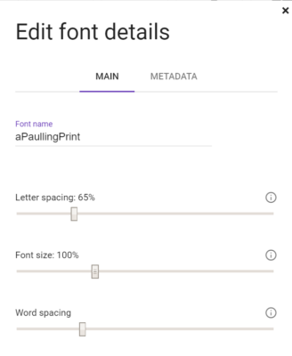
 Step 4 : Build your Font and Try it Out!
When you have everything uploaded, click on “Build Font” and choose “randomize characters”. This will include all the variations of each character you uploaded. If the preview window that comes up makes things look weird, or not like your natural writing, close the window and head to “Edit Font Details”. I had to bring in my font character spacing quite a bit to make it look more natural for what my handwriting looks like. I like my letter close together to save space.
Once thats adjusted, try building the font again. Keep playing with it till it looks like you want, then download the two files from the top of the window. They are the two links that say “yourfontname.tff” and “yourfontname.otf”. Right click and “save link as…” those to a folder on your computer.
To install the font into windows, just browse to the folder where you saved them, and double click one of them to open it. Click “install” in the window that pops up and voila! The font is now on your computer, and you can browse for it in your word processor of choice. Sometimes, randomization of a font is not enabled by default in Word, so follow this tutorial to get that working.
You can also upload your font into wordpress, if you want to do exactly what I’ve done here and use it in a website, with a free plugin called “Use Any Font“
Support us on Patreon!
I hope you've enjoyed this tutorial! Please consider donating on our Patreon page! The more money we raise, the bigger and more elaborate project tutorials we can do for you!
Check out the Patreon Page
Comments
This is an awesome idea but I have one question: Will the files work the same way on my macbook?
Hey Mike! Yes, these file types can be installed on a mac as well, but the process is a little bit different. You’ll do all the above to create the font and then follow this tutorial on how to install them and use them : https://www.idautomation.com/kb/macOSX-fonts-install.html